
Friday, 3 December 2010

Photos for Promotion Package
Below are the two photos me and my partner took on the main filming day, which will be used in our movie poster and film magazine front cover. Each photo was set up so that they would match a scene or clip of footage from the trailer, so that the audience will understand the link between the footage and photos without having to thinking too hard. There were numerous photos that we took, however we only used these two photos because we felt they were the most effective out the collection we had.
 We used features from both photos and merged them together on photoshop. The protagonist was cut out of this photo, and super imposed onto the photo below. This was because the image below was too dark and didn't show any highlighting of the protagonist which we needed in order to link the trailer and posters together.
  This image was chosen for the background of the poster and magazine because it showed a good contrast between light and dark features. Once both images have been been put together, they will form the background for the movie poster and the movie magazine front cover.
Initial Ideas For Front Cover

This design is very conventional of a magazine front cover in terms of where each feature is laid out and how it looks when the finished product is completed. The big, noticeable magazine name at the top of the page will easily recognizable from a distance when on the shelf. Also, I like that fact that the sub-stories and pug are on the left hand side of the page so that when the magazines are stacked on a shelf, they can still inform potential buyers about what the content of the magazine is. The headline is nicely tucked in at the bottom of the page, making it noticeable enough as well as leaving enough room for the main image on the front cover. Due to these reasons, I will be using this design for the layout of the front cover of the movie magazine.

This design is relatively similar to the design above, but it isn't as well laid out in comparison. I believe that the pug would better on the left hand side of the page, than being potentially placed over the main image and detracting from it's selling power. The sub-stories are in the right place however it would be better if they filled the first third of the page as the small gap looks odd and out of place. Finally, there is a gap underneath the headline which I feel needs to be used up with either a smaller headline or some sort of text, as the gap again looks out of place. Due to these reasons I will not be using this design for the movie magazine front cover.

This design goes back to putting most of the information on the first third of the page, which is good for when it gets stacked on a shelf. However I prefer the layout on the first design with the pug at the top of the page, which would make it more attention grabbing. Other than that, I feel that the headline really should be at the bottom of the page as the magazine name will be at the top as well and could out-shadow it. Plus the reader's eyes will be working down the page as they read, starting off with the name of the magazine, then the photo, then the headline to tell them what the photo is about. I feel that this design will not be as effective in conveying the information to the audience, therefore I will not be using this design for the front cover of the movie magazine.
Initial Ideas For Film Poster

This design is the one I prefer most out of the three initial ideas that were drawn because I believe it is able to inform the audience much easier due to the layout. This is because when the audience look at the image their eyes are drawn downwards, towards the bottom of the page. Therefore it make sense to have the film name underneath as it would be the second thing the viewer sees. This is also a convention that is commonly used in the designing of film posters, therefore I want to follow this convention in order to make the poster as appealing to the audience as possible.

This design would still be effective in giving the audience information as it still sticks to a similar layout as the design above, with just the tag-line and film title switched around. However it is more effective if the film title is at the bottom due to the way we interpret and look at different things. The credits remain in the conventional place, as this is where they are commonly positioned if being featured on the film poster. Therefore, due to a matter of preference, I will not be using this design for the film poster.

This is the design I dislike the most as I feel the main features are too cluttered at the bottom of the page. In some cases this design can work, however in my personal opinion I feel like there would be too much writing at the bottom of the page. I believe it could make the poster look uneven and untidy as there needs to be a balance between text and images, therefore I am not going to be using this design for the film poster.
Thursday, 2 December 2010
Editing Process
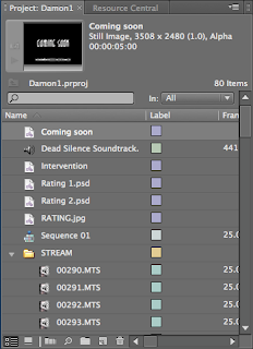
 For the editing stages during the Main Prodution of the Trailer we made significant use of a piece of Softwarre name 'Adobe Premiere Pro' on Apple Mac. This was the introduction of a brand new piece of material which we were using so the first thing we began with was the various tools which were included, what they did and how to use them correctly so we get used to using the software.
We searched for some Music which wanted to use within Our Trailer on YouTube, once we discovered the Track we wanted we then extracted the Track through a Converter which changed the Format of the file to MP3 so it would play on the Stream of the Trailer. The first thing we done was import the Soundtrack which were going to utilise for the mainstream track of the Trailer. We done this first so that the footage could be cut accordingly to the Melody as there are moments in the Track which builds suddenly and we deemed appropriate for striking footage to be attached to it.

Along the Left Hand side of the page all the Footage and Clips are arranged in a column,
each clip is only a few seconds long depending on when the shot was cut and finished. This is part of the Video Camera Technology provided as on the Camera from when you Press Play and Stop that entire piece of Footage becomes one clip as opposed to having one long Stream of Footage which you would have to Cut and move around into a position where you want it. The clips disable this and enable you to work with the short shots that have been captured. We dragged and dropped the clips we wanted on the stream and then cut the Track using the Razor Tool appropriately. We made the decision to have the introductory images start before the Soundtrack is even heard. We used a'Green Ratings Screen' first which then using the Video Effects Tab we faded this into the following Screen which is 'D&A Productions', thus then beginning the Track. As you can see, the Track and Video Streams are on different streams so that they can all be Cut accordingly. If the beginning of the Trailer is not effective then it will lose the interest of the Audience.

We got a 'Green Screen Ratings' off of Google Images and inserted this into the Stream through importing it, this convention was appropriate to include because generally this appears at the introduction of the majority of Horror Movie Trailers and we wanted to make our Product appear as professional as possible. This is also done so that the Audience watching are aware of the Age Rating of the film so when they go to see the Film they know whether or not they will be allowed to view it, depending on their age. This is placed at the beginning of the Trailer so that Audiences are immediately aware this film may not deem appropriate for certain ages.

As we began to progress further into the Production of the Trailer we continued to add more footage, using the Razor Tool majorly we Cut and lengthened the Clips accordingly and then began positioning them in the places we felt were most appropriate where they fit best to the intense moments within the Soundtrack. When the rise action begins, we wanted to follow the conventions and made sure that the clips were not overly long otherwise the Audience would get bored and we wanted to convey as much footage we collected as possible to create variety. We done this so that we had shots which coincided with the Music perfectly making them extremely effective for the Trailer, sometimes even emitting an eerie and on edge feel, we done this so it would raise tensions within the Audience.

Using Photoshop we created the imagery for the Title and the 'Coming Soon' Screen as it was important to have continuity and have the same text for both the Title of the film and that specific screen so they interlinked. After we created them we were able to import them and treat them in the exact same way we edited the rest of the Video using the Tools provided. Using a feature which is included within Premiere Pro we utilised this to produce the caption screens for the Trailer. We did not want the same Font used for theTitle and 'Coming Soon' Screens because we wanted to differenciate them away from the rest of Trailer so they would act more iconic for the Film as opposed to the entire Trailer.

After we completed the Production of the Trailer we felt that to make it appear more Professional that we should add some Critical Praise and Ratings for the Film to urge and lure the Audience into wanting to go and see it depending on how well the Ratings appear. So, using Photoshop we created the Captions in the same fashion as we did the Title and then imported then and Cut then in according to the Soundtrack. But, for the Ratings we wanted to add a distorting effect which made them Flicker to the Music and have a Jump in the Music to make the whole thing seem eerie and distorted. So we split the Track using the Razor Tool,copied it so that the same piece of Track was doubled and placed them next to each other so make a jumping noise in the Track. We done the same with the Ratings Videostream and inserted a blank, black screen in between so it quickly flashed to black and then reverted back, this being cut in time with the Music. This same process was repeated for another Ratings Screen to add variety.
Re-Shoots
Re-Shoot Number 1:
- Wide shot of the protagonist rushing swiftly, panic inflicted past the camera and entering the house.
Location:
- Exterior of the House
Problem(s):
- Technical difficulties: Unstable Camera due to no tripod.
Re-Shoot Date:
- Lighting difficulties: Filmed at dusk, misty.
- The quality was poor.
Re-Shoot Date:
- November 15th 2010
Re-Shoot Number 2:
- Long/Wide Shot of the Protagonist answering the door, yet she is completely unaware that there are people within her domain.
- Long/Wide Shot of the Protagonist answering the door, yet she is completely unaware that there are people within her domain.
Location:
- Interior the House, the Main Hallway
Problem(s):
- Technical Difficulties: Unstable Camera due to no tripod.
In The Frame:
- Staircase, Narrow Hallway & the Front Door/Porch.
Problem(s):
- Technical Difficulties: Unstable Camera due to no tripod.
- Significant plot changes and shot re-arrangements.
Re-Shoot Date:
- The addition of the Second antagonist.
Re-Shoot Date:
- November 15th 2010
Re-Shoot Number 3:
- Shot of the Antagonist underneath the glow of the street lamp, gradually approaching and getting closer towards the camera.
- Shot of the Antagonist underneath the glow of the street lamp, gradually approaching and getting closer towards the camera.
Location:
- Exterior, within the neighbourhood.
Problem(s):
- Lighting Difficulties: Daylight clashed with the glow of the Street Lamp.
- Changes in the shot.
- Lighting Difficulties: Daylight clashed with the glow of the Street Lamp.
- Changes in the shot.
- Limited Purposes for Shots.
- Significant plot changes, the addition of the Second Antagonist.
Re-Shoot Date:
- Significant plot changes, the addition of the Second Antagonist.
Re-Shoot Date:
- November 15th 2010
Re-Shoot Number 4:
- The Protagonist is hiding behind a breakfast bar. The antagonist walks slowly behind the bar scraping a knife along the counter.
Location:
- The Protagonist is hiding behind a breakfast bar. The antagonist walks slowly behind the bar scraping a knife along the counter.
Location:
- Interior, the kitchen.
Problem(s):
- Technical Difficulties: Unstable Camera due to no tripod.
- Shot and Angle changes for this specific shot.
- The addition of the Second Antagonist.
- The quality was poor.
Re-Shoot Date:
Problem(s):
- Technical Difficulties: Unstable Camera due to no tripod.
- Shot and Angle changes for this specific shot.
- The addition of the Second Antagonist.
- The quality was poor.
Re-Shoot Date:
- November 15th 2010
Re-Shoot Number 5:
Hill Shot facing downwards, the Antagonists enter the scene and head towards the house where the Protagonist has just gone to.
Location:
- Exterior, a hill next to a Cul De Sac.
Problem(s):
- The Shot was filmed on a road where cars were continuely passing by which were not part of the Mise-En-Scene.
- The quality was poor.
- Lighting Difficulties: The street lamp that was illuminating the Area was not strong enough.
Re-Shoot Date:
- November 15th 2010
Re-Shoot Number 6:
- This shot is a wide shot of the Outside to see the action occur from an outsider point of view.
- This shot is a wide shot of the Outside to see the action occur from an outsider point of view.
Location:
- Exterior of the Front Entrance.
Problem(s):
- Technical Difficulties: Unstable camera due to no tripod.
- Lighting Difficulties: The shots were difficult to film as the dusk lighting and lights clashed so the action was difficult to see.
- Shot and angle compositions needed to be significantly changed.
Re-Shoot Date:
- November 15th 2010
Re-Shoot Number 7:
- The protagonist is sat down, hears a bang and then approaches the front porch via a second door through the living room.
Location:
- Interior of the house
Problem(s):
- Technical Difficulties: Unstable Camera due to no tripod.
- Technical Difficulties: Unstable Camera due to no tripod.
- More shot and Angle compositions were need for diversity,
- Original footage was poor quality.
- Changes of style.
Re-Shoot Date:
- November 15th 2010
Locations For Filming
The photos below each represent the different locations at which we filmed for the production of our trailer. The locations were kept very local so that any shots that needed re-filming, the sites would be easily accessible and open 24/7.


Timetable of Filming Schedule
Filming to Commence
Wednesday; October 13th 2010
-The filming of the 'Establishing Shots'.
Continuation of Filming
Sunday; October 17th 2010
-The shooting of the main footage. (Interior & Exterior shots of the Neighbourhood & the House).
Re-Shoots
Monday; November 15th 2010
-The Main Footage
Filming to be Completed
Tuesday; November 16th 2010


Wednesday, 1 December 2010
Final Ideas For Own Video
Camera Angles;
I want to use a wide range of shots in order to make the trailer look more dynamic, instead of a standard long shot throughout the whole sequence. This will be addressed by altering the height, tilt, pan and angle of the camera once on the tripod. The more interesting the trailer appears, the more likely your audience would want to see it in the cinema.
- Long Shot - This will be used for pan and establishing shots, which set the scene and location of the film. It will also be used as for long distance running scenes where the camera needs to get the whole of the protagonist in the frame as well as the movement that person makes.
- High Angled Shot - This shot would be used for making the protagonist appear small and helpless, this type of shot can be used in either a build up or action sequence.
- Low Angled Shot - This should would be used for making the antagonist appear more powerful and dominant. This shot would be used towards the end of a trail or an action sequence.
- Medium Close Up - This shot would be used for when we want to see a bit more emotion on the protagonist's face, as well as seeing their neck and shoulders, so the audience would be able to see the situation they were in.
- Extreme Long Shot - This shot will be used for clips that will be shot a long distance away from the character involved. These shots show the character in a large area of space, often used for putting people into perspective.
- Close Up - This shot would be used for showing detail in an object or location, as well as being used for showing emotion on a character's face, if needed.
Editing;
For the editing of the film trailer I want to use a selection of editing techniques that will fit the footage to the conventions of a horror movie trailer. This will include transitions, types of cuts and the layout of the footage.
- Blunt Cut - This editing cut will be used for faster action clips in the trailer when the drama reaches it's highest point, due to cuts needing to be short and quick in order to fit in time with background music.
- Jump Cut - This cut can be used to shorten long passages of footage by taking sections a few seconds long (anything between 1 - 3 seconds) out of it, whilst keeping it in chronological order. If you are able to fit it to beats in the music, the audience will see it was invisible editing and the music emphasizes the jump/change of position of the footage.
- Fade to Black - This transition will be used at the start and ending of slower clips in the trailer, often placed on establishing shots and captions. It builds up the scene gradually instead of it just flashing it up from black, which gives the impression of slower movement and less suspense. Perfect for the beginning of the film trailer.
- Flash to Black - This will be used in captions and in areas of greater suspense in the trailer. By flashing a to a black background for a fraction of a second gives the impression of a light going out, which in some cases people find very scary. This is why this is a convention that I will be utilizing within the film trailer project.
Mise-en-Scene;
The Mise-en-Scene of the ideal shots were based upon tried and tested methods that had been done before in horror movies, of which will be transformed and adapted to this film trailer project.
- Composition - The composition of the shots used will be kept the best of our ability to stick to the rule of thirds, so that the most important parts are placed either on a line or where two lines cross over. This will be done so that the audience can concentrate on the parts of the trailer we want them to focus on, as your eyes don't focus directly at the middle of a page. Other fundamental techniques will be used in the composition such as where the horizon falls, how much sky there is in the shot, and whether or not actors and ideal natural surrounding fit in the frame correctly.
- Props - There will be limited amount of props being used as they aren't that necessary for the parts of the trailer we intend to film. This is because we want to show body movement, body language and emotions which limits the amount of props we need. The props that we will be using in the trailer are a mobile phone that belongs to the protagonist, a knife as a potential murder weapon and two white theatre masks that will be the defining look for the antagonists in our trailer.
- Actors - There will be three casted actors in the trailer - one male, two female - who will play a character each. We want a female protagonist and one male and one female antagonist as the characters in the trailer.
- Costumes - For the costumes in the trailer we decided on straight away that all the actors were going to be dressed in casual clothes. This is because the protagonist will be taken by surprise therefore will still be dressed in her casual clothes. We want the antagonists to be dressed in casual clothes because it is unconventional and the audience wouldn't expect it, potentially making the film more shocking to them.
- Lighting - The lighting for the outside shots will be completely natural, we wont be using any other lights to enhance features of the mise-en-scene, we will just be using the daylight available to us, so that we can get day, dusk and night shots. For the inside lights we will be using ceiling spotlights on dimmers so that we can get the best possible inside brightness level, as mounted wall lights for casting shadows and illuminating features of the house.
Sound Effects;
There wont be many sound effects being added too our trailer, as we are going to take advantage of pitch, tempo changes, beats and rumbles already present in the background music. However we plan to use a couple of sound effects at strategic points in the trailer when the audience will be least expecting it.
- Door Bang - It will be a quick, loud knock on the door which will be used before a rise in action and a change of tempo in the background music. This will be seen as the turning point or trigger point in the trailer which starts to build up to the most dramatic period.
- Scream - We want to use a scream towards the end of the trailer to catch the audience out and make them scream or jump as a response. This features in many trailers towards the end - and if not a scream - there will be a loud noise played to scare the unsuspecting viewer.
- Heartbeat - Towards the end of the trailer we want to fade out the music and replace it with the sound of a repeating sound bite of a heart beating. The intention is to fit some footage over the top of it to give the trailer a slow but frightening ending, by the use of a scream afterwards.
Music;
The background music in the trailer will be borrowed from another horror movie called "Dead Silence". It is the theme tune to "Dead Silence" but does not play on it's trailer, therefore in using this music for our project we have mentioned the film name, composer's name and record studio in the credits of the film, as well as on the poster. This music was chosen because it starts of slowly and gradually increases in tempo and pitch, as well as having different beats and climaxes present. This was perfect for matching our footage to, as the climaxes are great points to cut scenes to and scare the audience.
Special Effects;
There will not be any special effects in the trailer project as they are not needed as we don't feel they would enhance the trailer in a way we would like. Special effects would be very useful in action genres, with explosions and gun shots, but they would not fit into our horror trailer correctly.
Setting;
We want to use already available buildings and backdrops as there isn't the budget or time limit for building sets from scratch. We want to use both outside and inside shots at different locations. For the outside scenes we will be using three locations; the first being a church, the second being a graveyard and the third and final one being my street. These will be used because they are easily accessible and safe to film in, as well as being perfectly suited for a horror movie. The inside scenes will be based inside my house, in five locations rooms within. These will be the kitchen, the dining room, the hallway, the living room and finally the porch.
Dialogue;
Again, like special effects, we feel that voice overs and dialogue wont fit in properly with the horror trailer we want to make, although it is used in horror genres, we want to break the convention and do something a little bit different to everything else, which is why we decided that there wont be any dialogue featuring in our movie trailer.
Subscribe to:
Comments (Atom)